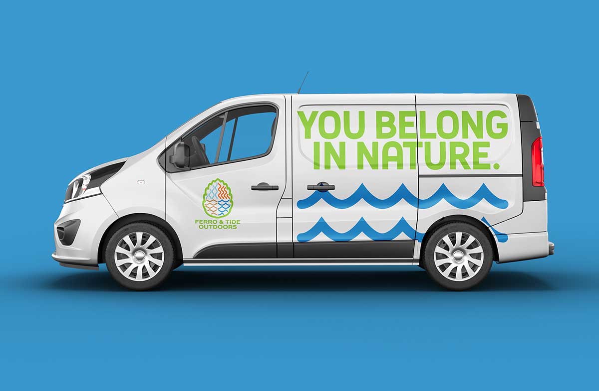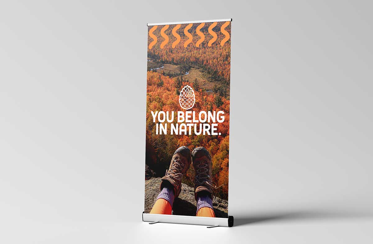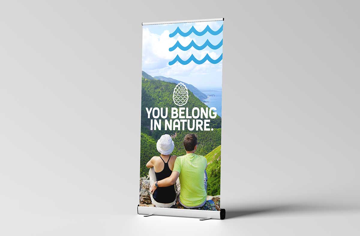
You Belong in Nature.
Outdoor education and community care rooted on Nova Scotia’s Eastern Shore and in the Musquodoboit Valley.
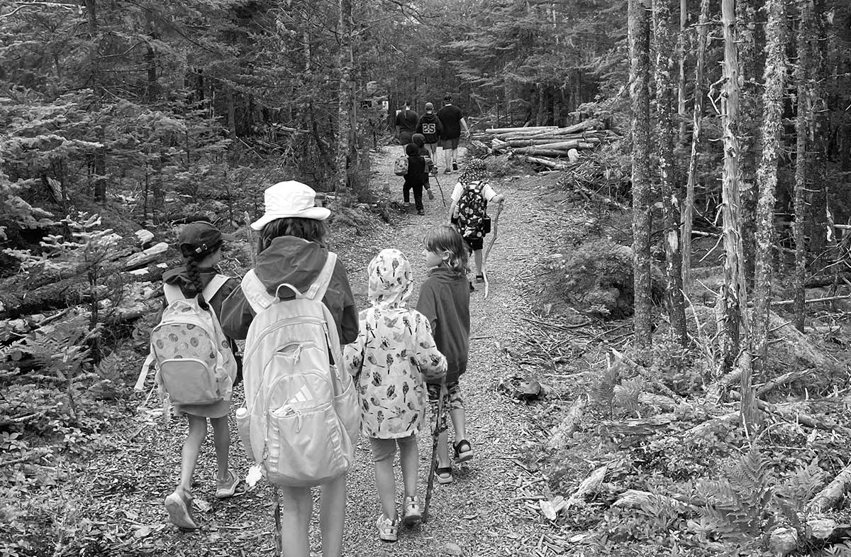
Ferro & Tide Outdoors creates opportunities for people to step outside, slow down, and build a deeper relationship with the natural world, and with each other.
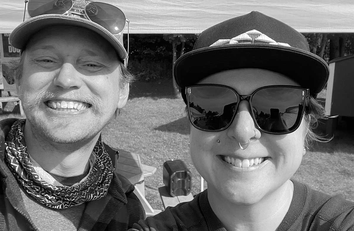
Founded by Edward ‘Fin’ Finigan and Thunder Shanti (F&T). Offering nature-based learning, outdoor skills training, and community programming, their mission is to make connecting with nature accessible and achievable for everyone.

Challenge
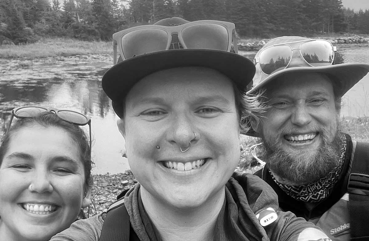
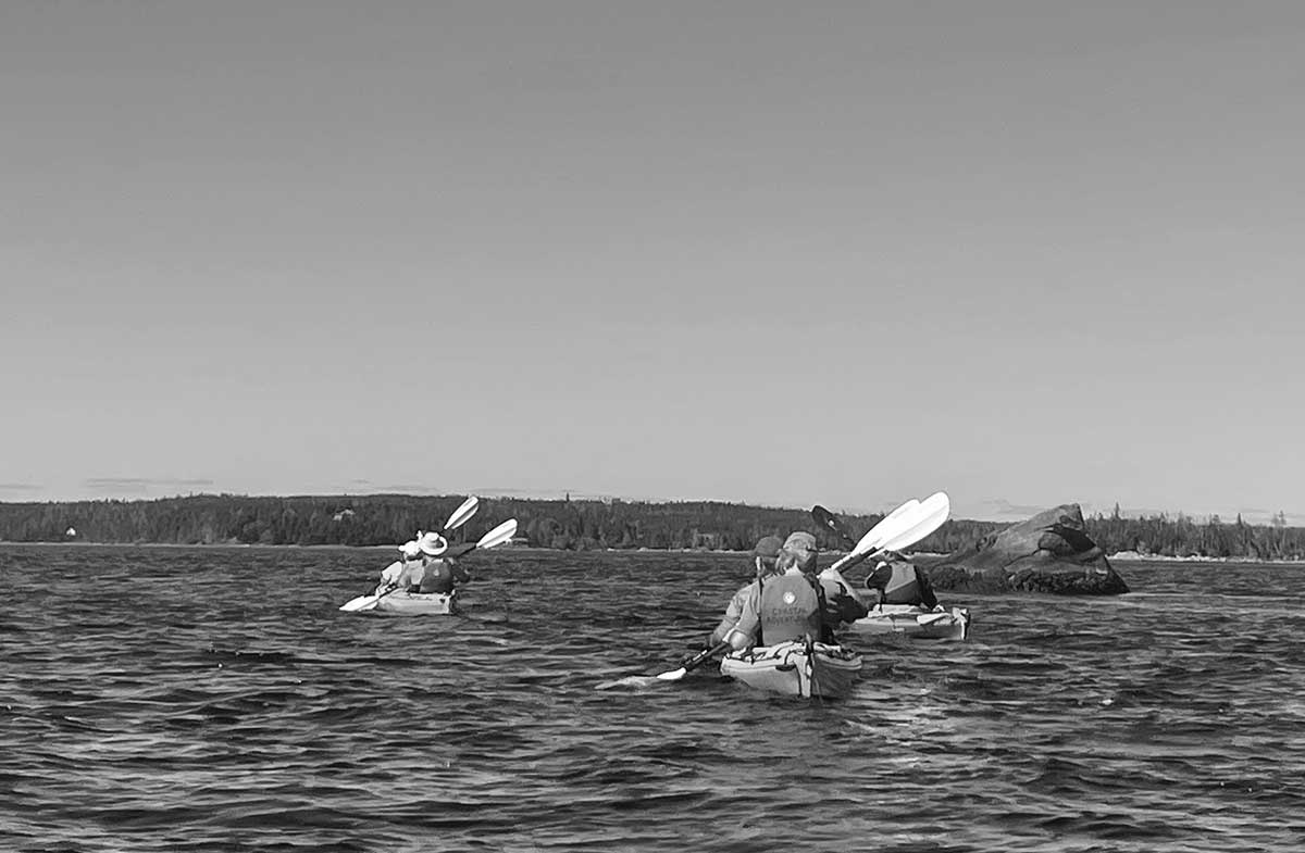
Ferro & Tide approached Orlando Media with a brand vision, a keen sense of direction and a need for a cohesive visual identity to bring their vision to life.
The challenge was to create a distinctive, welcoming identity that reflected their commitment to connection, belonging, and accessibility, while providing the flexibility to grow across diverse programs and audiences.
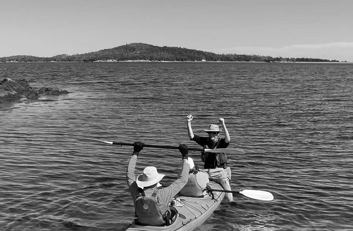
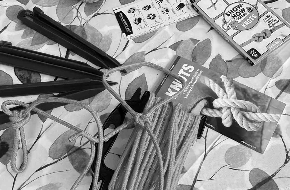
Solution
Orlando Media established five defining brand pillars: connection, belonging, community, accessibility, and growth.
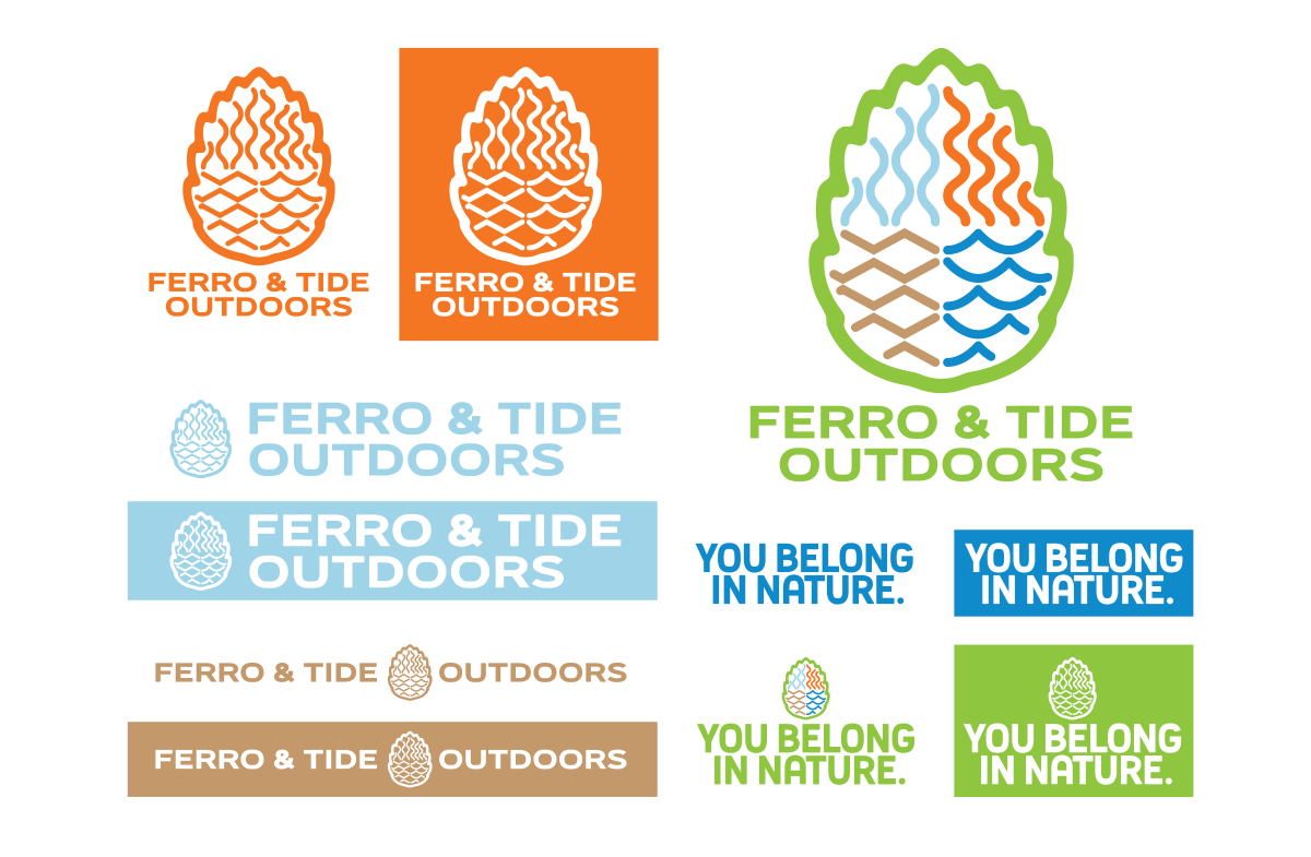
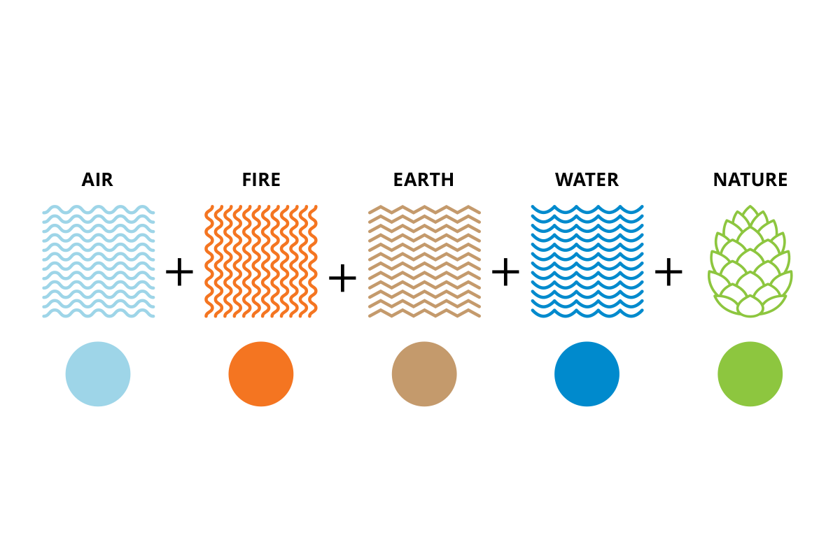
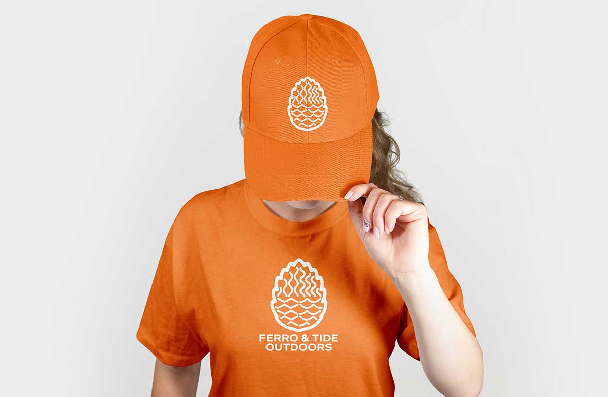
Forged from the natural elements of fire, water, earth, and air, a distinctive visual identity was developed that brought these forces together in a unified symbol. Contained within the cone of Nova Scotia’s official tree, the red spruce. A foundational species of the Atlantic Canada wilderness; the tree is able to survive in virtually any terrain and condition and was chosen to represent the strength and resilience of Nova Scotians.
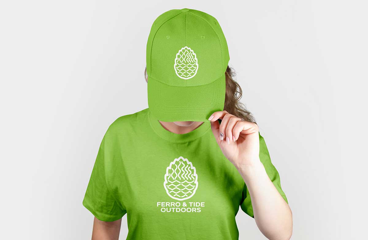
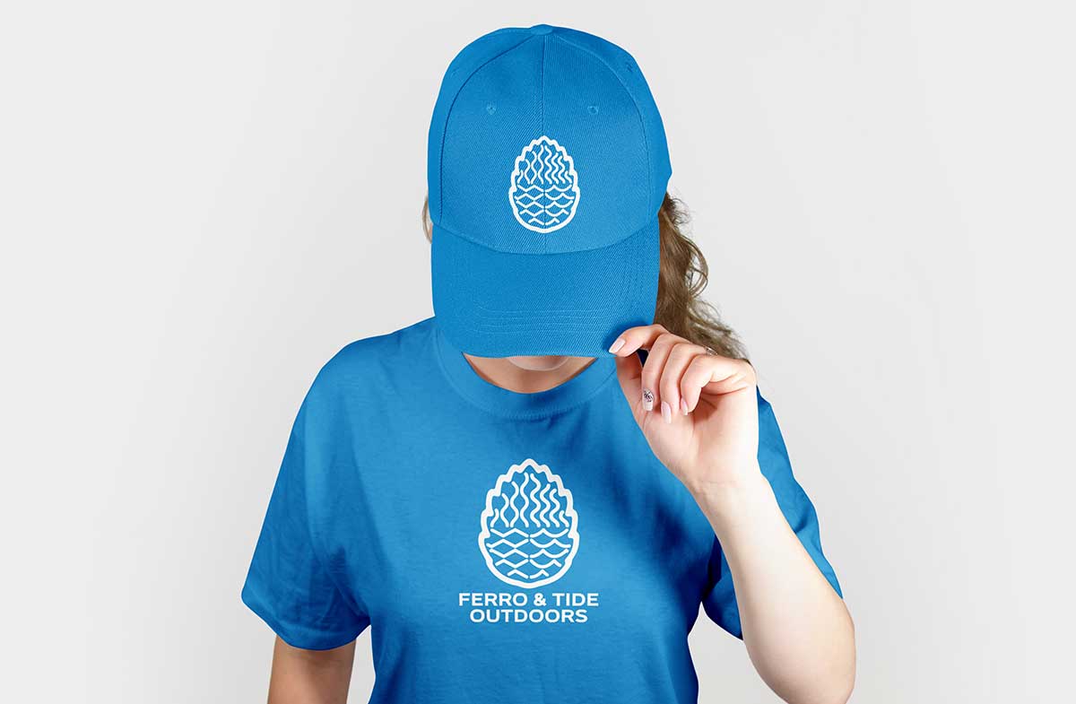
Organic forms, a vibrant nature-inspired colour palette, and typography referenced from hand-lettered trail signage, create an inclusive, timeless and evergreen brand.
Designed for flexibility and growth. A versatile logo system and playful use of colour accommodates different programs and separation of program offerings. Multiple arrangements will allow for different layout placement needs. A canopy brand with multiple offerings underneath made to grow as Ferro & Tide grows. All nimble and adaptable.